With the advances now available in Book Bolt Studio’s newer story-creation features, it’s easier than ever to generate a children’s book quickly. But while tools can help you draft text and structure, the part that still benefits most from an organic creative approach is what children’s books have always done best:
They communicate before a single word is read.
Through color.
Through shape.
Through visual rhythm.
And that’s why certain children’s book designs feel “classic.” They’re not just cute—they’re psychologically readable. They’re built from visual signals that children intuitively understand.
Let’s break down why.
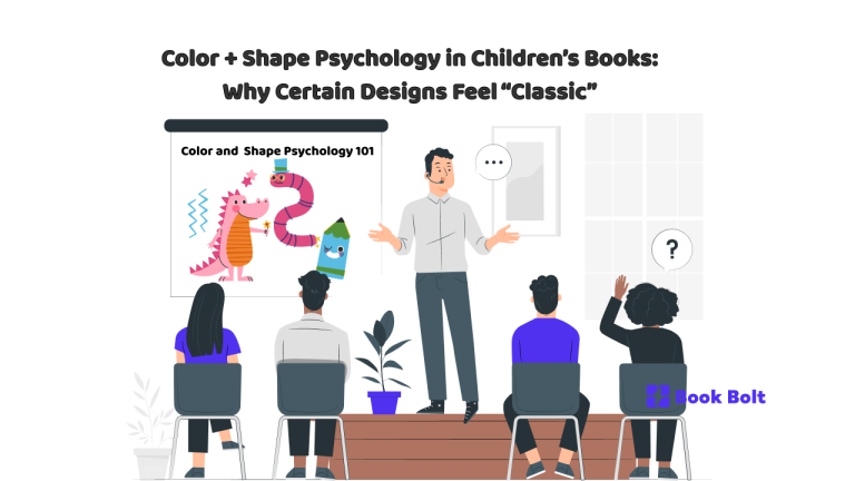
The secret: kids “read” pictures as emotional instructions
Adults often treat illustration as decoration.
Kids treat it as guidance.
Color and shape tell a child:
- “This is safe.”
- “This is funny.”
- “This is exciting.”
- “This might be scary, but it’s okay.”
- “Pay attention here.”
Before a child can parse a sentence, they’re already forming judgments based on visuals. That’s why your design choices aren’t cosmetic. They’re part of the storytelling system.
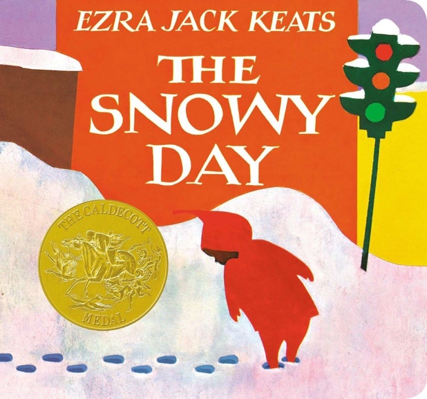
Why certain palettes feel timeless
1) Warm colors feel like welcome
Warm colors (reds, oranges, yellows) tend to signal:
- energy
- friendliness
- “come closer”
- play
That’s why warm palettes are common in early childhood books: they pull kids in.
Used well, warm colors create emotional accessibility.
2) Soft, muted palettes feel like comfort
Muted tones and pastels can feel:
- gentle
- cozy
- calm
- bedtime-friendly
This is why “classic-feeling” picture books often avoid harsh contrast on every page. Too much visual intensity can feel overstimulating.
Muted doesn’t mean boring. It means regulated.
3) High contrast is attention—use it like a spotlight
High contrast (black/white, bold complementary colors) grabs attention fast.
In kid books, contrast is best used for:
- the main character
- the important object
- the moment of surprise
- the “pay attention now” beat
If everything is high contrast, nothing is.
But a controlled contrast strategy feels professional and classic—because it creates visual hierarchy.
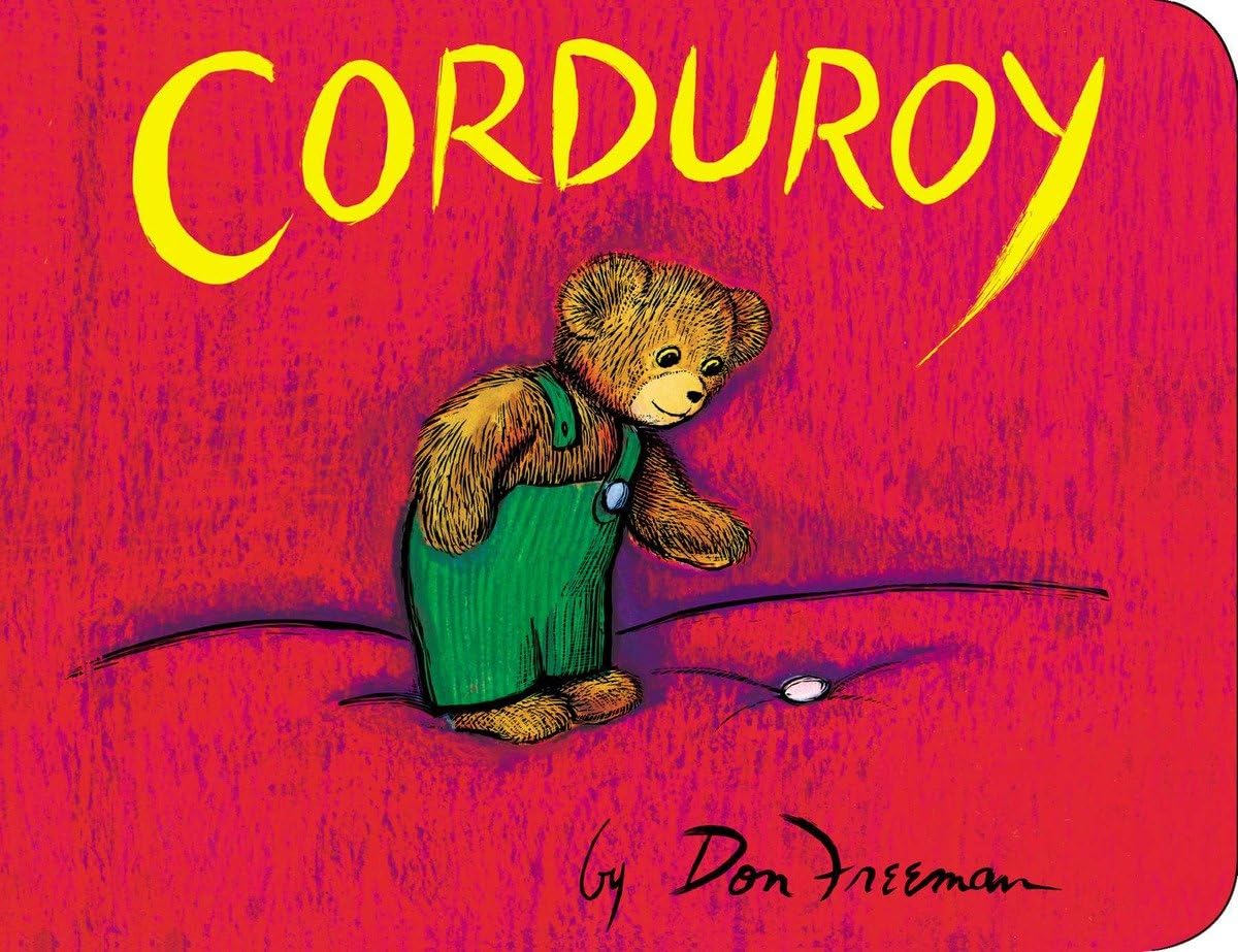
Shapes: the emotional body language of illustration
1) Round shapes feel safe
Rounded shapes signal:
- softness
- friendliness
- approachability
That’s why so many “classic” kid characters are built from circles and ovals:
- big round heads
- soft cheeks
- rounded paws
- simple curves
Round shapes are the visual equivalent of a warm voice.
2) Sharp shapes feel dangerous (or at least “serious”)
Sharp angles signal:
- threat
- tension
- strictness
- “don’t touch that”
That doesn’t mean you should avoid them. It means you should use them intentionally.
A classic children’s book often uses sharp shapes to define:
- the villain
- the obstacle
- the “bad idea” moment
This is visual storytelling at its simplest: the shape language tells the child who to trust.
3) Simple shapes feel iconic
Kids recognize symbols faster than detail.
That’s why “classic” design often uses:
- clean silhouettes
- strong readable outlines
- simplified features
A character with a strong silhouette becomes:
- easy to remember
- easy to spot on a shelf
- easy to reproduce on merch and activity pages later
Classic kids’ design is rarely overly complex. It’s designed for recognition.
Visual rhythm: why “classic” books don’t look chaotic
A lot of modern design mistakes come from one impulse: fill every inch.
Classic-feeling children’s books often have:
- breathing room
- consistent margins
- repeatable page patterns
- a predictable flow of “busy page” then “rest page”
This rhythm is soothing. It tells a child:
- “you can handle this”
- “you won’t get lost”
- “this story is safe”
And that’s why rhythm reads as classic: it respects the reader’s attention span and emotional bandwidth.
Why certain design choices age better than “trends”
Trends often rely on:
- very specific internet aesthetics
- niche jokes
- visual noise
- design flourishes that date quickly
Classic design tends to rely on:
- readability
- emotional clarity
- icon-level simplicity
- limited, purposeful palettes
That’s why some books feel timeless: they were built to be understood, not to be fashionable.
Practical guidelines: how to make your Book Bolt children’s project look “classic”
If you’re creating children’s books (and using Book Bolt Studio as part of the workflow), here are simple rules that keep your visuals from feeling chaotic:
1) Pick one emotional goal per book
Is this book:
- cozy?
- silly?
- adventurous?
- gently spooky?
Your palette and shapes should match the goal.
2) Choose a “hero palette” of 3–5 colors
Then choose 1 accent color for emphasis.
Classic design is controlled design.
3) Make your main character mostly round
Even if your character is a monster. Especially if your character is a monster.
If it’s “safe scary,” roundness does a lot of work.
4) Use sharp shapes only for contrast and meaning
Villain silhouettes, storm clouds, thorny bushes—sharp shapes say “careful.”
5) Keep typography readable
Classic children’s book typography usually:
- avoids overly thin fonts
- avoids decorative scripts for body text
- keeps high contrast between text and background
- uses consistent sizing and spacing
Kids may not read the words yet—but adults do. And adults decide what gets purchased.
The deeper truth: classic design is “trust design”
Parents buy what looks trustworthy.
Kids return to what feels emotionally readable.
So when color and shape choices feel classic, what they’re really saying is:
- “This book is safe.”
- “This book is clear.”
- “This book knows what it’s doing.”
That’s how visual psychology turns into sales—and rereads.